
Plotting Data
How to plot charts for dataset
Plotting
During a competition, there must be a number of features and some of them might make more influence on the target value than others.
So It’s very useful to plot each feature versus target value.
Assume that we’re going to draw a image below: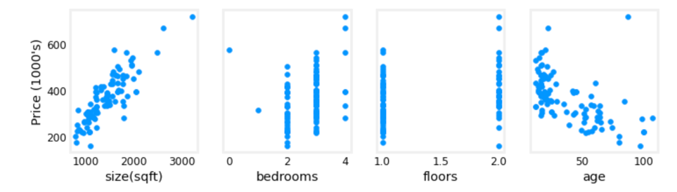
We can write these code in python:
1 | fig,ax=plt.subplots(row_num, column_num, figsize=(plot_weight, plot_height), sharey=True) |
Here are some explanations:
- fig: the container of all imgs(there are four in the img above)
- ax: the array contains all imgs(e.g., ax[0] refers to img one, ax[1] refers to img two, …)
- sharey: “true” means all imgs share Y-axis scale
- ax[i].scatter(X_train[:,i], y_train): plot scatter chart for i’th img, using the i’th feature for X-axis and target value in dataset for Y-axis
- ax[i].set_xlabel(X_features[i]): set the label of X-axis with i’th feature’s name
- ax[0].set_ylabel(“Price (1000’s)”): set the label of Y-axis with target value’s name, which in the example is “Price (1000’s)”
- heatmap 热区图
1
2
3
4
5
6# Seaborn Library
import seaborn as sn
fig, ax = plt.subplots(figsize=(10, 5))
corr = df.corr()
sn.heatmap(corr, annot=True) - histogram 柱状图, 直方图
1
2
3
4
5# matplot library
import matplotlib.pyplot as plt
fig, ax = plt.subplots(row_num, column_num)
df.hist(axis=ax, edgecolor='black', grid=True) - scatter 点图
1
2
3
4
5
6
7
8
9
10# matplot library
fig, ax = plt.subplots(row_num, column_num, figsize=(24, 4), sharey=True) # sharey: 共享y坐标系
y = df['label'].to_numpy()
for i in range(len(ax)):
X = df[column_list[i]].to_numpy()
ax[i].scatter(X, y)
ax[i].set_xlabel(column_list[i])
ax[0].set_ylabel('Label')
plt.show()